

Hi dear welcome to Ascode Blog . In this post we are going to learn to makeing css recipe card design for your blogpost. First Creat A index.html file Copy This HTML CODE and pest it one your code editor. 2ndly creat style.css file Then Copy The CSS CODE and pest it then open the file with your browser.
HTML
<!DOCTYPE html>
<html lang="en">
<head>
<meta charset="UTF-8">
<meta http-equiv="X-UA-Compatible" content="IE=edge">
<meta name="viewport" content="width=device-width, initial-scale=1.0">
<title>food recipe card for blogpost</title>
<link rel="stylesheet" href="style.css">
</head>
<body>
<div class="card">
<div class="col-1">
<div class="c1">1</div>
<div class="author">Alena Smith</div>
<div class="recipe-name">New Breakfast<br>Recipe</div>
<div class="description">These last few weeks I have been working hard<br> on a new brunch recipe for you all.</div>
<div class="line">---------------------------------- <span>Read more</span></div>
<div class="c">c</div>
</div>
<div class="col-2">
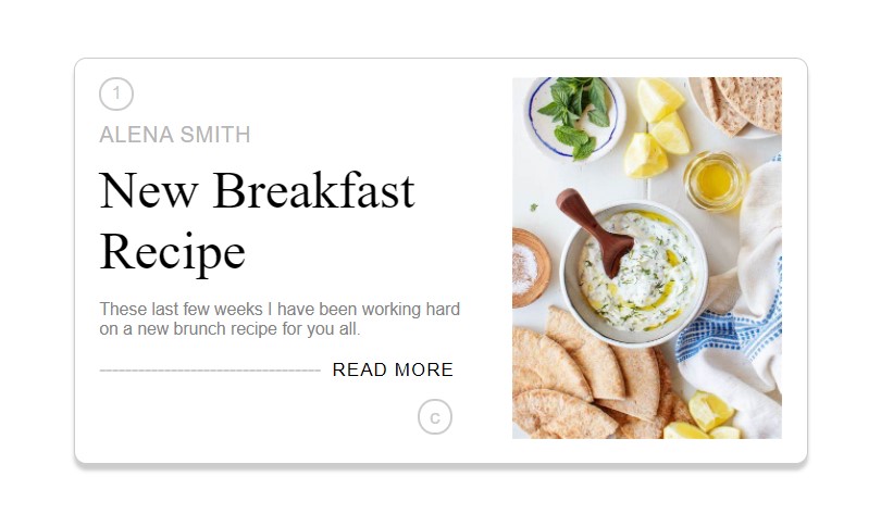
<img src="https://th.bing.com/th/id/OIP.uZ8_IaMThltaWS2zVDnHnAHaJ_?pid=ImgDet&rs=1" alt="">
</div>
</div>
</body>
</html>
CSS
*{
margin: 0;
padding: 0;
font-family: sans-serif;
box-sizing: border-box;
}
body {
display: flex;
justify-content: center;
align-items:center ;
min-height: 100vh;
background: #fff;
}
.card {
position: relative;
background: #fff;
border: 1px solid #ccc;
border-radius: 10px;
box-shadow: 0 5px 3px #ccc;
padding: 15px 20px;
width: 600px;
transition: 0.5s;
}
.card:hover {
width: 620px;
}
.col-1 {
width: 300px;
float: left;
}
.col-2 {
width: 220px;
float: right;
}
.col-2 img {
width: 220px;
}
.author {
font-size: 18px;
color: rgb(182, 182, 182);
text-transform: uppercase;
margin: 10px 0;
letter-spacing: 0.5px;
}
.recipe-name {
font-size: 2.7rem;
font-family:none;
color: #000;
font-weight: 500;
}
.description{
font-size: 14px;
color: rgb(131, 131, 131);
margin:15px 0;
}
.line {
margin: 15px 0;
color: #ccc;
}
span {
font-size: 15px;
color: #000;
letter-spacing: 1px;
text-transform: uppercase;
padding: 5px;
transition: 0.5s;
}
span:hover {
background: linear-gradient(45deg,#30284e,#f09);
color: #fff;
border-radius: 5px;
}
.c {
position: relative;
color: #ccc;
border: 2px solid#ccc;
border-radius: 50%;
padding: 3px 8px;
width: fit-content;
font-size: 17px;
left: 260px;
transition: 0.5s;
}
.c1 {
position: relative;
color: #ccc;
border: 2px solid#ccc;
border-radius: 50%;
padding: 3px 8px;
width: fit-content;
font-size: 15px;
transition: 0.5s;
}
.c:hover,.c1:hover {
background: linear-gradient(45deg,#30284e,#f09);
}


0 Comments