

Hi dear welcome to Ascode Blog . In this post we are going to learn how to make an animated css info card design. First Creat A index.html file Copy This HTML CODE and pest it one your code editor. 2ndly creat style.css file Then Copy The CSS CODE and pest it then open the file with your browser.
HTML
<!DOCTYPE html>
<html lang="en">
<head>
<meta charset="UTF-8">
<meta http-equiv="X-UA-Compatible" content="IE=edge">
<meta name="viewport" content="width=device-width, initial-scale=1.0">
<title>CSS INFO CARD</title>
<link rel="stylesheet" href="https://cdnjs.cloudflare.com/ajax/libs/font-awesome/5.15.3/css/all.min.css">
<link rel="stylesheet" href="style.css">
</head>
<body>
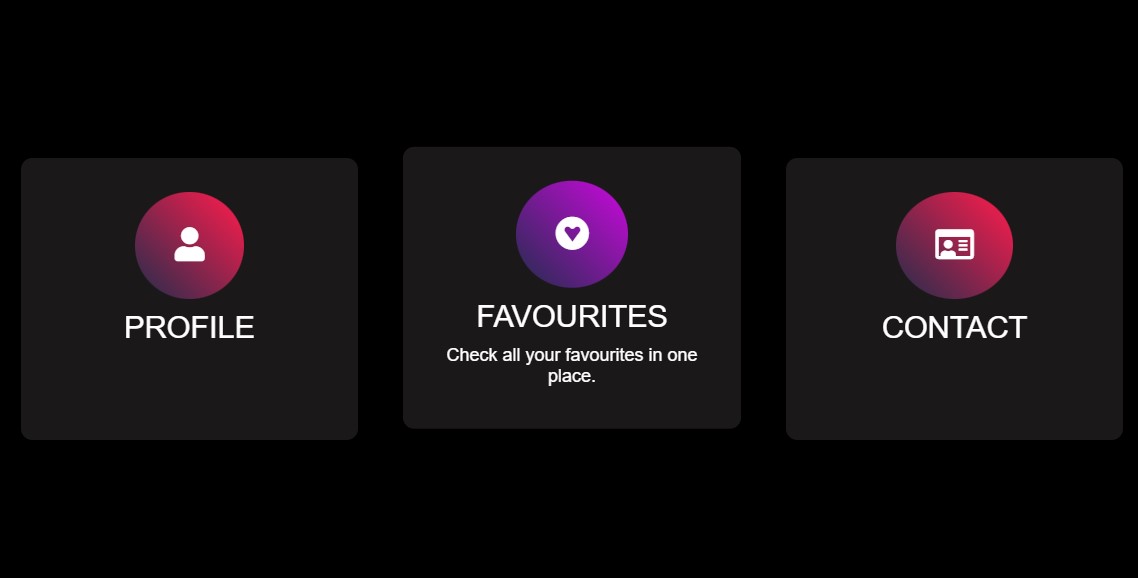
<div class="card">
<div class="icon"><i class="fas fa-user"></i></div>
<div class="tittle">PROFILE</div>
<div class="text">Click to see or edit your profile page.</div>
</div>
<div class="card">
<div class="icon"><i class="fab fa-gratipay"></i></div>
<div class="tittle">FAVOURITES</div>
<div class="text">Check all your favourites in one place.</div>
</div>
<div class="card">
<div class="icon"><i class="far fa-id-card"></i></div>
<div class="tittle">CONTACT</div>
<div class="text">Add or change your contacts and links.</div>
</div>
</body>
</html>
CSS
*{
margin: 0;
padding: 0;
font-family: sans-serif;
box-sizing: border-box;
}
body {
display: flex;
justify-content: center;
align-items:center ;
min-height: 100vh;
background: #000;
animation: color 1s linear infinite;
}
@keyframes color {
0% {
filter: hue-rotate(0deg);
}
100% {
filter: hue-rotate(360deg);
}
}
.card {
width: 300px;
height: 250px;
background: rgb(26, 24, 24);
margin: 20px;
padding: 20px;
border-radius: 10px;
text-align: center;
transition: 0.5s;
}
.icon {
background:linear-gradient(45deg, #30284e,rgb(243, 40, 4)) ;
padding: 30px 35px;
font-size: 30px;
width: fit-content;
border-radius: 50%;
text-align: center;
align-items:center ;
margin: 10px auto;
color: #fff;
}
.tittle {
color: #fff;
font-size: 1.7rem;
margin: 10px auto;
}
.text {
color: #fff;
font-size: 1rem;
margin: 10px auto;
display: none;
transition: 0.5s;
}
.card:hover .icon {
background:linear-gradient(45deg, #30284e,#f09) ;
}
.card:hover .text {
display: block;
}
.card:hover {
transform: translateY(-10px);
}


0 Comments