

Hi dear welcome to Ascode Blog . In this post we are going to learn how to make movie ui card design forusing html and css. First Creat A index.html file Copy This HTML CODE and pest it one your code editor. 2ndly creat style.css file Then Copy The CSS CODE and pest it then open the file with your browser.
HTML
<!DOCTYPE html>
<html lang="en">
<head>
<meta charset="UTF-8">
<meta http-equiv="X-UA-Compatible" content="IE=edge">
<meta name="viewport" content="width=device-width, initial-scale=1.0">
<title>Movie website card design</title>
<link rel="stylesheet" href="https://cdnjs.cloudflare.com/ajax/libs/font-awesome/5.15.3/css/all.min.css">
<link rel="stylesheet" href="style.css">
</head>
<body>
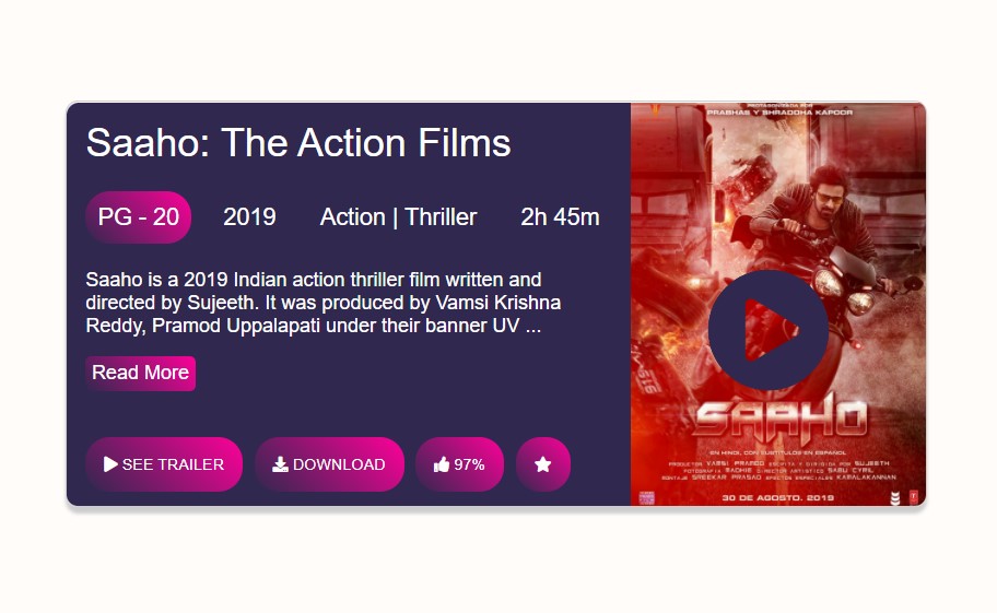
<div class="card">
<div class="col-1">
<div class="container">
<div class="tittle">Saaho: The Action Films</div>
<div class="pg-important">
<span class="pg">PG - 20</span>
<span>2019</span>
<span>Action | Thriller</span>
<span>2h 45m</span>
</div>
<div class="description">Saaho is a 2019 Indian action thriller film written and directed by Sujeeth. It was produced by Vamsi Krishna Reddy, Pramod Uppalapati under their banner UV ...</div>
<div class="read">Read More</div>
<div class="movie-important">
<span class="rating"><i class="fas fa-play"></i> SEE TRAILER</span>
<span class="rating"><i class="fas fa-download"></i> DOWNLOAD</span>
<span class="rating"><i class="fas fa-thumbs-up"></i> 97%</span>
<span class="rating"><i class="fas fa-star"></i></span>
</div>
</div>
</div>
<div class="col-2">
<div class="icon"><i class="fas fa-play-circle"></i></div>
<img src="saaho.jpg" alt="">
</div>
</div>
</body>
</html>
CSS
*{
margin: 0;
padding: 0;
font-family: sans-serif;
box-sizing: border-box;
}
body {
display: flex;
justify-content: center;
align-items:center ;
min-height: 100vh;
background: rgb(255, 252, 250);
}
.card {
width: 700px;
height: 330px;
border: 1px solid #ccc;
box-shadow: 0 5px 3px #ccc;
border-radius: 10px;
overflow: hidden;
}
.col-1 {
width: 458px;
float: left;
background: #30284e;
border-radius: 10px 0 0 10px;
color: #fff;
}
.col-2 {
position: relative;
width: 240px;
float: right;
border-radius: 10px 0 0 10px;
bottom: -10px;
top: -5px;
}
.col-2 img {
position: relative;
width: 240px;
height: 340px;
border-radius: 0 10px 10px 0;
bottom: -5px;
top: 0;
right: 0;
background-size: cover;
}
.container {
margin: 10px 15px;
}
.tittle {
font-size: 2rem;
margin:15px 0;
}
.pg-important {
display: flex;
justify-content: space-between;
margin: 20px 0;
font-size: 1.2rem;
}
span {
padding: 10px;
border-radius: 20px;
}
span.pg {
background: linear-gradient(45deg,#30284e,#f09);
}
.description {
font-size: 1rem;
margin: 15px 0;
}
.read {
background: linear-gradient(45deg,#30284e,#f09);
padding: 5px;
border-radius: 5px;
width: fit-content;
}
.movie-important {
margin: 50px 0;
}
.rating {
background: linear-gradient(45deg,#30284e,#f09);
padding: 15px;
font-size: 0.8rem;
transition: 0.5s;
margin-right:5px;
}
.rating:hover {
padding: 20px;
}
.icon {
position: absolute;
color: #30284e;
z-index: 1000;
justify-content: center;
text-transform: uppercase;
align-items: center;
margin: 50% 20%;
font-size:8rem;
animation: bounce 1.7s linear infinite;
}
@keyframes bounce {
10% {
transform: scale(0.3);
}
100% {
transform: scale(1.7);
}
}


0 Comments