

Hi dear welcome to Ascode Blog . In this post we are going learn how to make smooth transition css card design using html and css. First Creat A index.html file Copy This HTML CODE and pest it one your code editor. 2ndly creat style.css file Then Copy The CSS CODE and pest it then open the file with your browser.
HTML
<!DOCTYPE html>
<html lang="en">
<head>
<meta charset="UTF-8">
<meta http-equiv="X-UA-Compatible" content="IE=edge">
<meta name="viewport" content="width=device-width, initial-scale=1.0">
<title>Transition card</title>
<link rel="stylesheet" href="style.css">
</head>
<body>
<div class="wrapper">
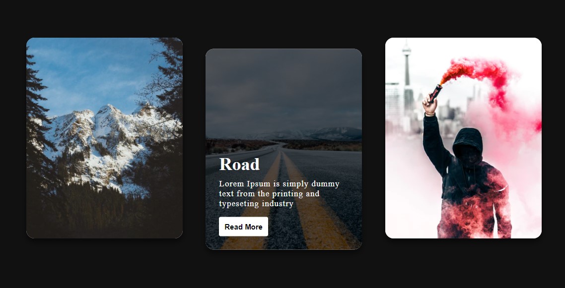
<div class="card"><img src="https://images.unsplash.com/photo-1477666250292-1419fac4c25c?auto=format&fit=crop&w=667&q=80&ixid=dW5zcGxhc2guY29tOzs7Ozs%3D"/>
<div class="info">
<h1>Mountain</h1>
<p>Lorem Ipsum is simply dummy text from the printing and typeseting industry</p>
<button>Read More</button>
</div>
</div>
<div class="card"><img src="https://images.unsplash.com/photo-1425342605259-25d80e320565?auto=format&fit=crop&w=750&q=80&ixid=dW5zcGxhc2guY29tOzs7Ozs%3D"/>
<div class="info">
<h1>Road</h1>
<p>Lorem Ipsum is simply dummy text from the printing and typeseting industry</p>
<button>Read More</button>
</div>
</div>
<div class="card"><img src="https://images.unsplash.com/photo-1503249023995-51b0f3778ccf?auto=format&fit=crop&w=311&q=80&ixid=dW5zcGxhc2guY29tOzs7Ozs%3D"/>
<div class="info">
<h1>Protester</h1>
<p>Lorem Ipsum is simply dummy text from the printing and typeseting industry</p>
<button>Read More</button>
</div>
</div>
</div>
</body>
</html>
CSS
* {
box-sizing: border-box;
}
body, html {
width: 100%;
height: 100%;
display: flex;
align-items: center;
justify-content: center;
background: #111;
}
.wrapper {
display: flex;
width: 90%;
justify-content: space-around;
}
.card {
width: 280px;
height: 360px;
border-radius: 15px;
padding: 1.5rem;
background: white;
position: relative;
display: flex;
align-items: flex-end;
transition: 0.4s ease-out;
box-shadow: 0px 7px 10px rgba(0, 0, 0, 0.5);
}
.card:hover {
transform: translateY(20px);
}
.card:hover:before {
opacity: 1;
}
.card:hover .info {
opacity: 1;
transform: translateY(0px);
}
.card:before {
content: "";
position: absolute;
top: 0;
left: 0;
display: block;
width: 100%;
height: 100%;
border-radius: 15px;
background: rgba(0, 0, 0, 0.6);
z-index: 2;
transition: 0.5s;
opacity: 0;
}
.card img {
width: 100%;
height: 100%;
-o-object-fit: cover;
object-fit: cover;
position: absolute;
top: 0;
left: 0;
border-radius: 15px;
}
.card .info {
position: relative;
z-index: 3;
color: white;
opacity: 0;
transform: translateY(30px);
transition: 0.5s;
}
.card .info h1 {
margin: 0px;
}
.card .info p {
letter-spacing: 1px;
font-size: 15px;
margin-top: 8px;
}
.card .info button {
padding: 0.6rem;
outline: none;
border: none;
border-radius: 3px;
background: white;
color: black;
font-weight: bold;
cursor: pointer;
transition: 0.4s ease;
}
.card .info button:hover {
background: dodgerblue;
color: white;
}


0 Comments